MICHIGAN FASHION MEDIA SUMMIT:
LOGO REBRANDS
The Stitch
The stitch is MFMS’s official publication. The publication showcases a biweekly newsletter containing interviews, profiles, Op-Eds, and more.
The logo had not been updated in about 5 years and no longer fit the brand’s theme following the 2024 MFMS rebrand.
Working with the Editor and Chief, we began a rebrand.
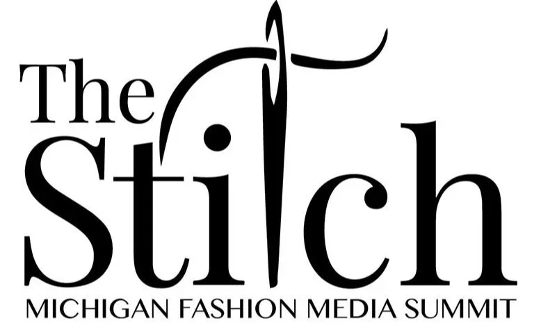
original logo
The Goal:
Create a more modern identity that still felt editorial, handmade, and connected to the name The Stitch. I wanted the logo to feel tactile and textural, using stitching itself as the visual language rather than relying on a traditional fashion-publication logo. This also helped bring the publication more in line with MFMS’s newer brand direction.
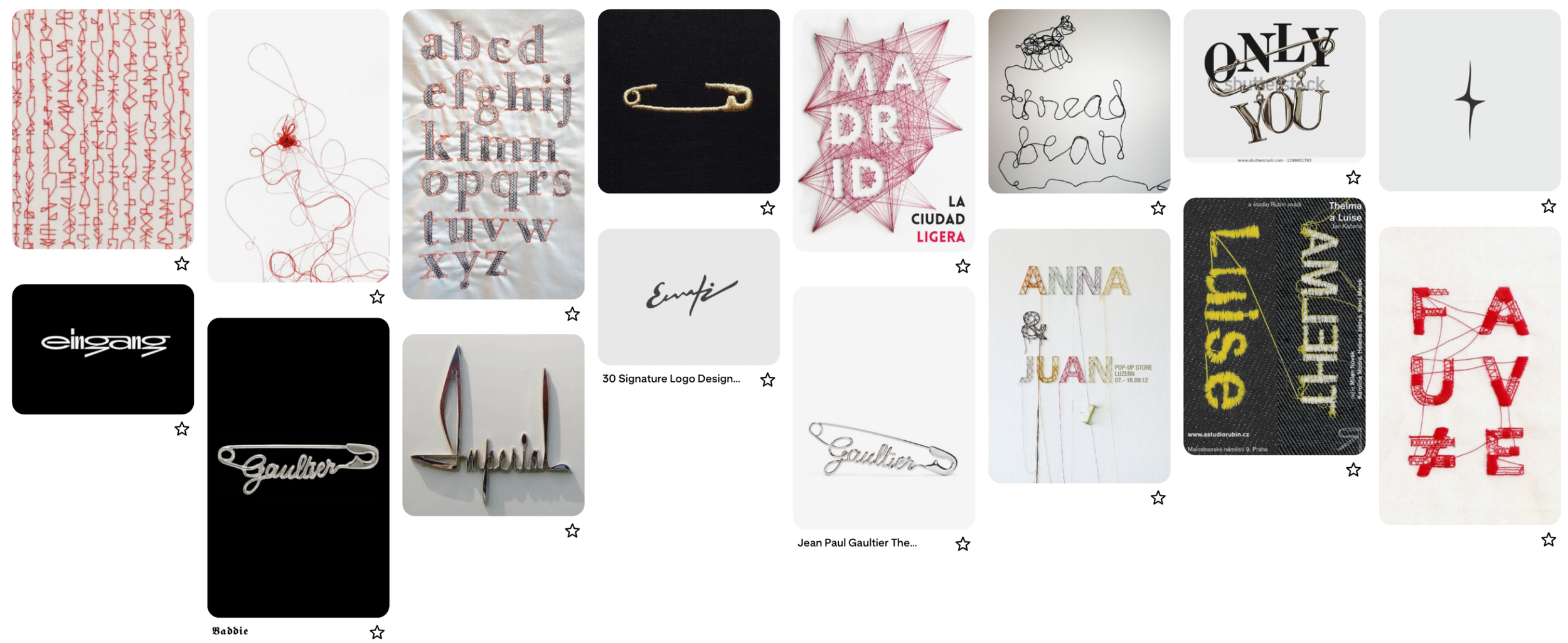
Moodboarding:
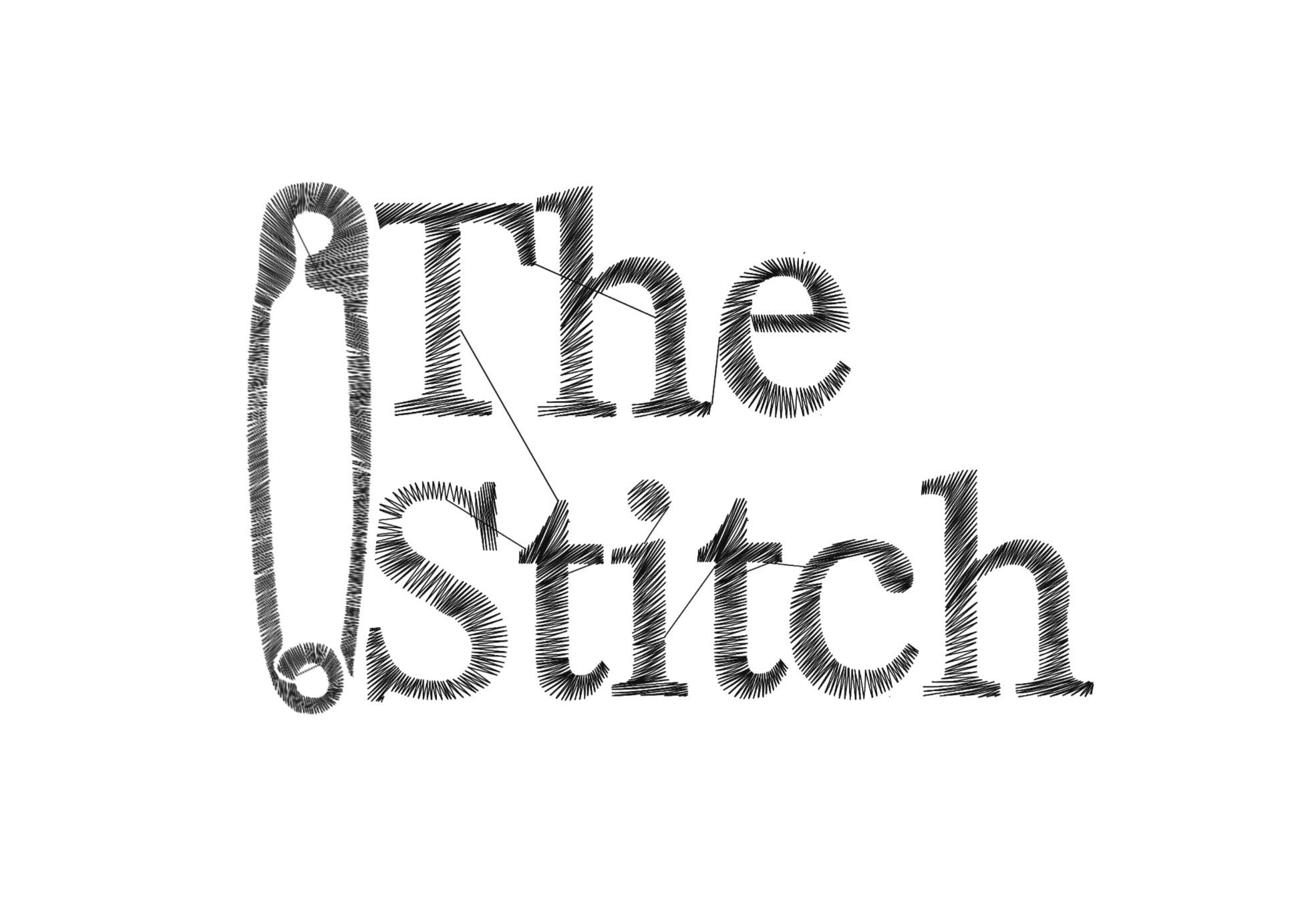
The Product:
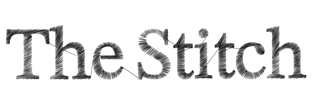
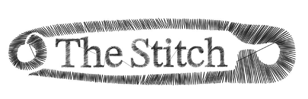
The final logo is entirely hand-drawn, with every individual line uniquely placed by me to build the letterforms. The layered strokes create a stitched, thread-like texture while maintaining the structure of a classic serif typeface, giving The Stitch a more distinctive and ownable visual identity.
The Loop
The Goal:
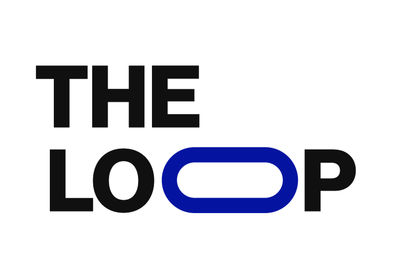
Create a bold, clean identity for The Loop that could stand on its own while still fitting naturally within the larger MFMS brand. Because the publication is focused on fashion news and primarily appears through social content, the logo needed to feel modern, recognizable, and easy to use across different layouts.
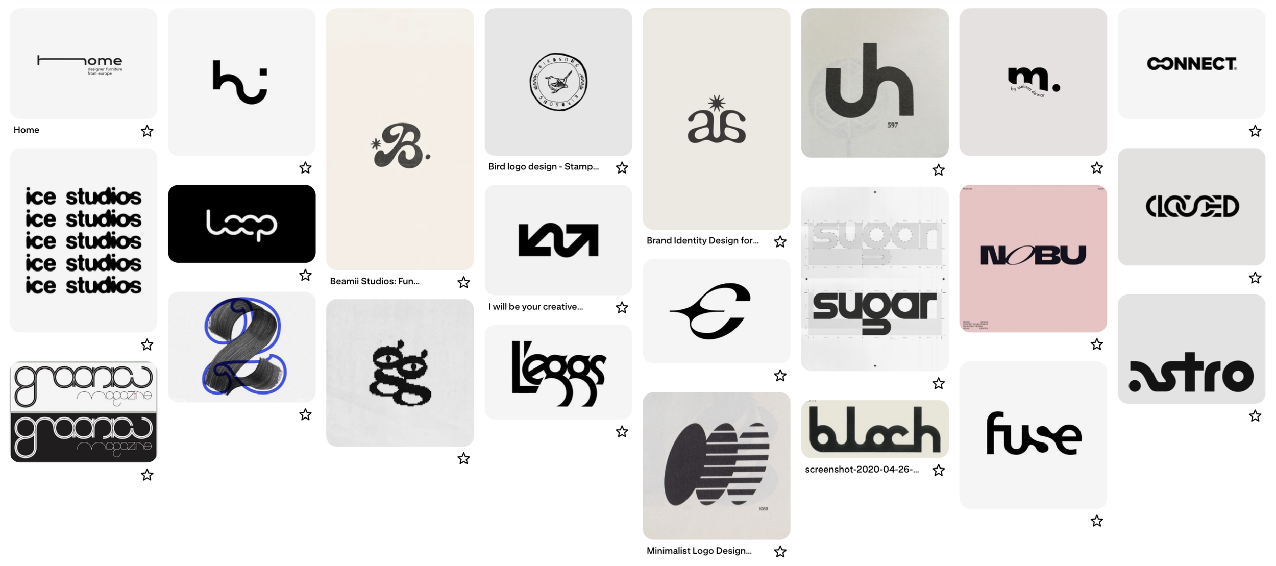
Moodboarding:
The Product:
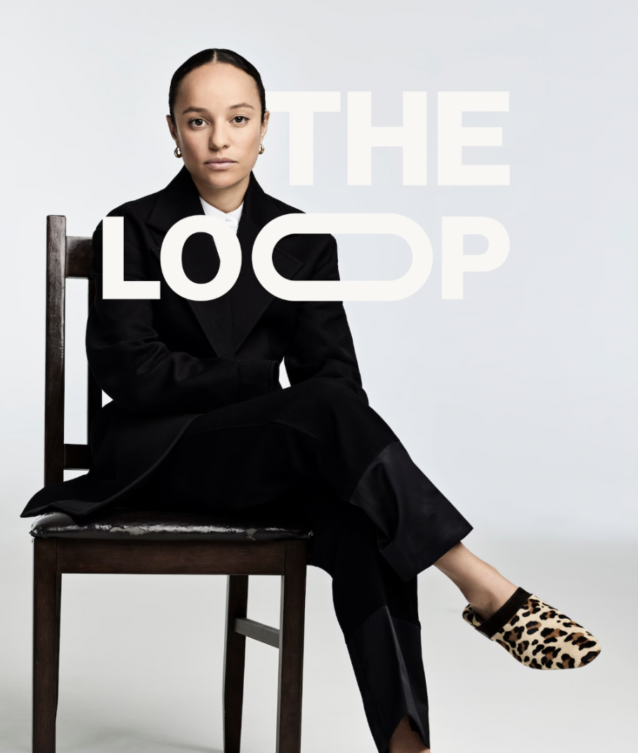
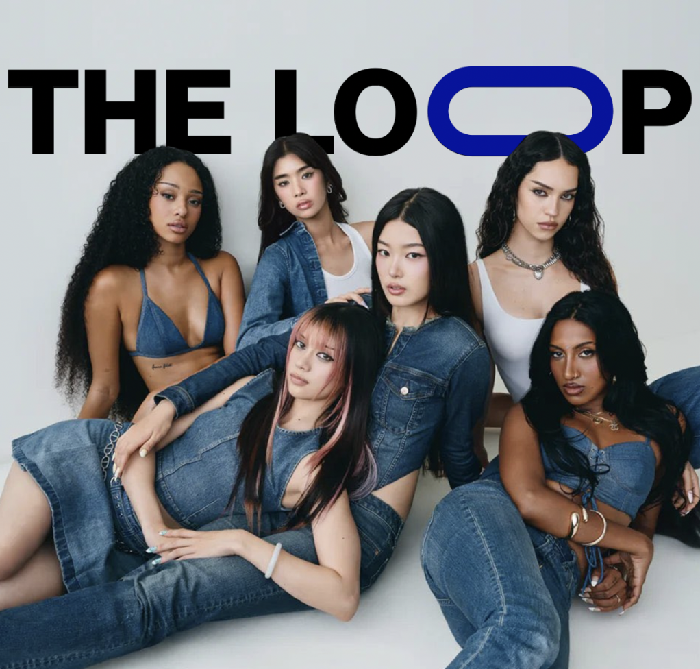
The final logo uses a simple geometric typeface with the “O” transformed into a continuous loop, connecting the visual identity to the publication’s name. Its strong typography and flexible black, white, and blue variations make it easy to layer over editorial imagery and create a consistent presence across social posts.