Case Study
:Stock-ticker design
Context:
a majority of competitor finance websites utliize in-article stock tickers. Stock tickers are consolidated displays of up to date information on a particular stock.
Goal:
Investopedia wants to implement tickers into our own website to provide additional context for users and stay up to date with competitors.
To do that, we must:
Understand how users interact with stock tickers online
Synthesize that information to develop a stock ticker for investopedia to maximize interaction and limit confusion
Role:
UX Design Intern: Responsible for all research, user interviews, design, and iteration of stock ticker implementation.
Timeline:
June - August, 2024
Step 1: IdentifyinG A NEED
Competitive analysis:
Before diving into research on our design, we needed to reaffirm the need for stock-ticker implementation.
I analyzed 6 companies on 13 different criteria, including:
Stock name
Location within the article
Presence of:
Value increase/decrease
Percent increase/decrease
Stock price
Option to expand
Hyperlinks
Ticker on homepage
Color for stock increase
Color for stock decrease
Color for unchanged stock
How stock change is indicated (arrows, +, -, etc)
Button shape

Notable results:
Each of the 6 competitor sites utilized stock tickers on their article.
100% of sites included the Stock’s abbreviated name, and none used the full name.
Displaying percent increase (6/6) was more popular than value increase (1/6)
All sites used Green to indicate an increase and red to indicate a decrease
No shape (1/2) or rounded buttons (1/3) were the most popular option
Hyperlinks were popular (2/3)
THE SURVEY
To begin the user research, I conducted a simple survey. I surveyed 35 participants who all passed 4 screener questions that identified them as frequent financial news consumers in a digital format.
Step 2: USER RESEARCH


After the four screener questions, the 35 participants answered 5 multiple choice questions to better understand how users interract with stock tickers and what they expect from them
Example question: When looking for further detail on a topic/keyword/company/stock, I prefer…
Questions like this one help us understand exactly what a user wants. Its clear that a simple summary isn’t extremely popular when looking for more information, so we needed to find ways to include more information on the page
USER INTERVIEWS: Conducted 4 virtual user interviews with selected participants who had passed the same survey screener questions
These interviews were structured in a more open-ended manner.
When first entering the interviews it was important to tell the participants a bit about myself and build a sense of rapport. I prepped them for what to expect in the interview, and encouraged asking questions, talking out loud as much as possible . I also reminded them to be entirely honest, as their true opinion would be the most helpful to my research.
The second part of the interview was me getting to know the participant, their occupation, hobbies, digital practices, and other tidbits like favorite apps/websites, and why.
the third part of the interview was diving deeper into questions regarding financial sites. I asked users to share what financial websites they liked, what type of media they consume, and to walk me through a recent experience using one of these sites. The goal of this section was to understand how the average customers interract with our site or similar sites. Were they browsing on the homepage? Coming for financial advice? Or maybe just keeping up to date on current events?
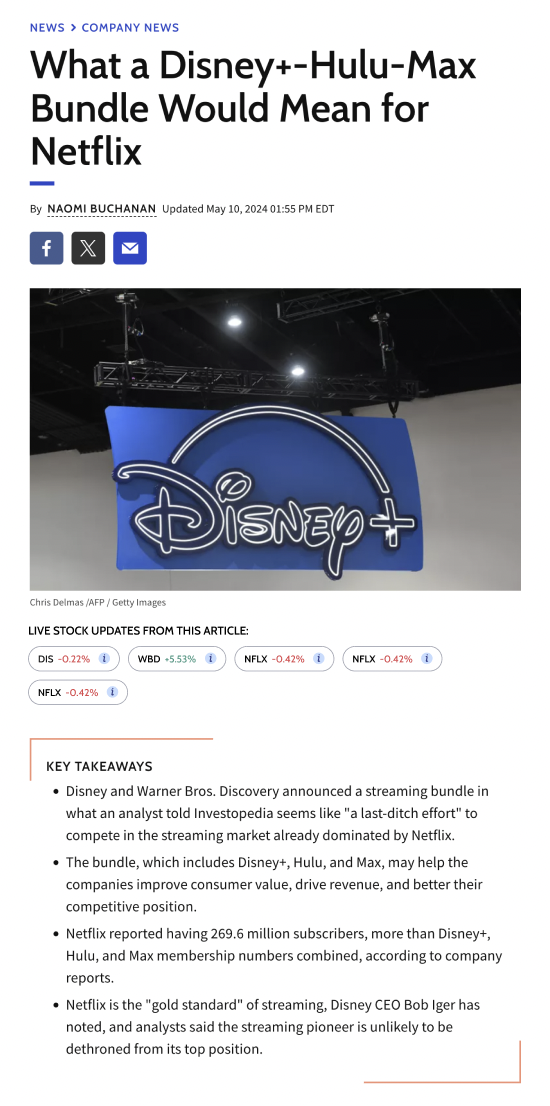
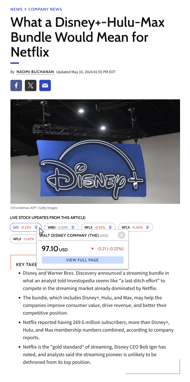
Finally, we entered the website navigation section of the interview. I shared with them a sample article detailing Chipotle’s recent stock split. I gaged their expectations of the page before they entered it, and then asked them to explore the page freely. Once they had finished exploring the page I directed them towards the stock tickers. I questioned the users on their familiarity with the tickers, what they thought the information was displaying, how it changed their perception of the article, if at all.

Step 3: Making sense of the data
Affinity mapping:
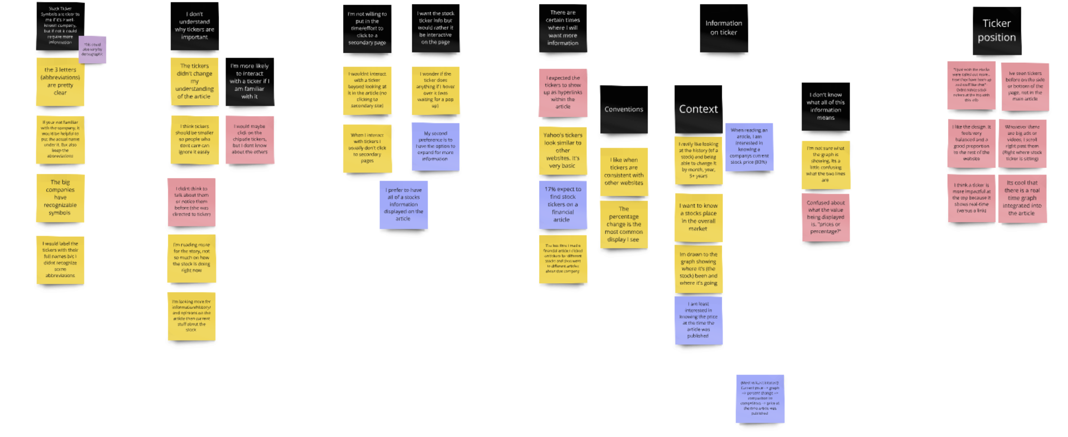
To best understand the information we collected, I organized an affinity mapping session. Five team members and I organized 30+ post it notes into thematic groups to reveal high level insights
Pain points:
“I don’t recognize abbreviations unless it’s a well known company”
“I am not willing to click to a secondary page”
“I don’t understand the relevance of the ticker(s) to the article”
“Tickers are hard to understand if they aren’t consistent with other websites”
Step 4: The Design
GOALS:
Incorporate a pop up/hover feature for further easily accessible information
Create a clear title for better comprehension
Keep design similar to comepetitor sites for familiarity
Remain cohesive to Investopedia’s design style and current stock display
Page load updates

Step 5: Testing The Design
To test my first iteration of stock ticker designs, I conducted 17 unmoderated interviews. 8 tested mobile option and 9 tested desktop.
Outcomes: Desktop
88.9% of participants used stock tickers as opposed to in-article hyperlinks to find further information on a stock
50% of participants never left the article page
Outcomes: Mobile
75% of participants used stock tickers as opposed to in-article hyperlinks to find further information on a stock
50% of participants never left the article page
Quotes:
“I like that you can click on it and it gives you more information. I feel like this is really user friendly” - Mobile Participant
“Thats nice how when you just [hover over it] it pops up… Super easy to find out the price of the stock, I loved it” - Desktop Participant
Step 6: finalizing The Design
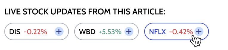
After presenting my final design to the Investopedia team, we began to work on finetuning. The team and I came to final edits, such as changing the (+) icon to an informatics icon for clarity and consistency and moving the location of popups to anchor it to the edges of the screen.
I want to give a huge thank you to everyone that helped me with this project. The entire 10-week internship provided me the best real world experience into the UX design process that I could have asked for.
The final designs are below.
Desktop
Mobile