Argus Farm Stop:
Reimagining a Meaningful Digital Shopping Experience
Background:
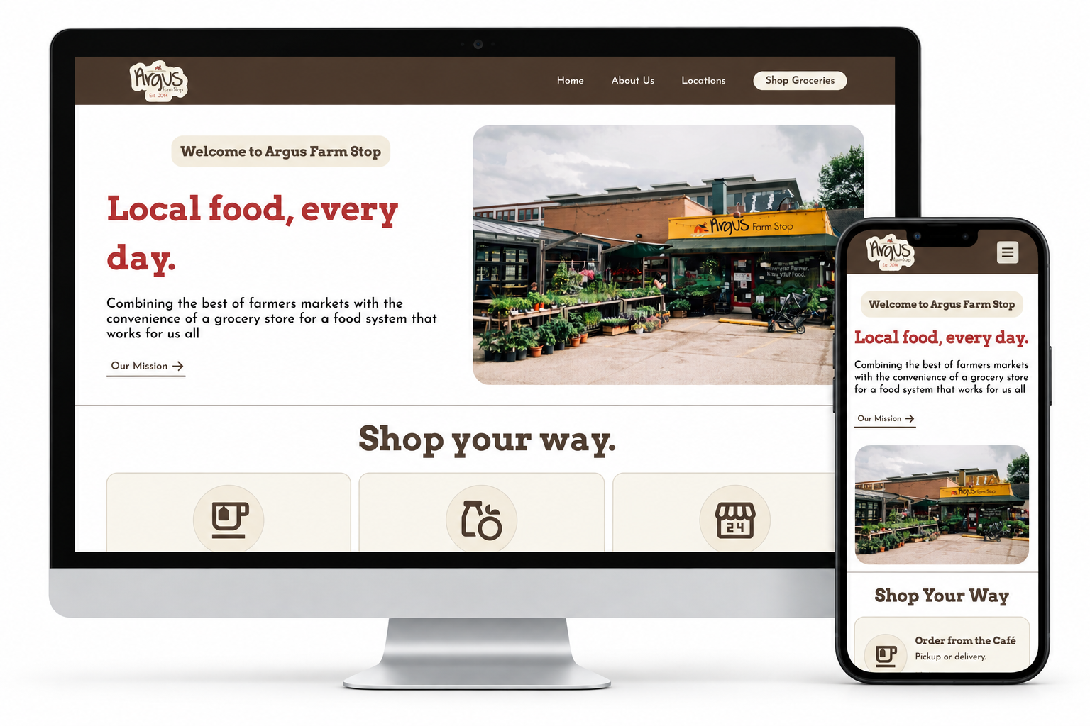
Argus Farm Stop is a local food market and cafe in Ann Arbor that connects local farmers to the Ann Arbor community. Argus’s locations are community spaces that combine the cafe experience with grocery shopping and prepared foods/ While the cafes have a clear emphasis on the local food economy, the website’s text heavy and dated pages provide a disconnected experience.
My goal was to redesign the shopping experience to make the experience more intuitive while preserving the identity of the in-store experience.
Interactive Final Prototype:
Explore my redesigned grocery ordering experience, from browsing products to completing an order for pickup.
User Testing Outline
Step 1: GATHERING INFORMATION
User research:
To better understand the business, I did two hours of direct observation at one location, a short customer interview, and a phone interview with an Argus employee. My goal was to understand the customer experience, what they value about Argus, and how the website could support business goals.
convenience is valued: many customers order to-go and the interviewed customer wanted an online ordering option
Product information needs to be clear: Customers had a hard time finding favorite items and reading small labels
Journey Maps:
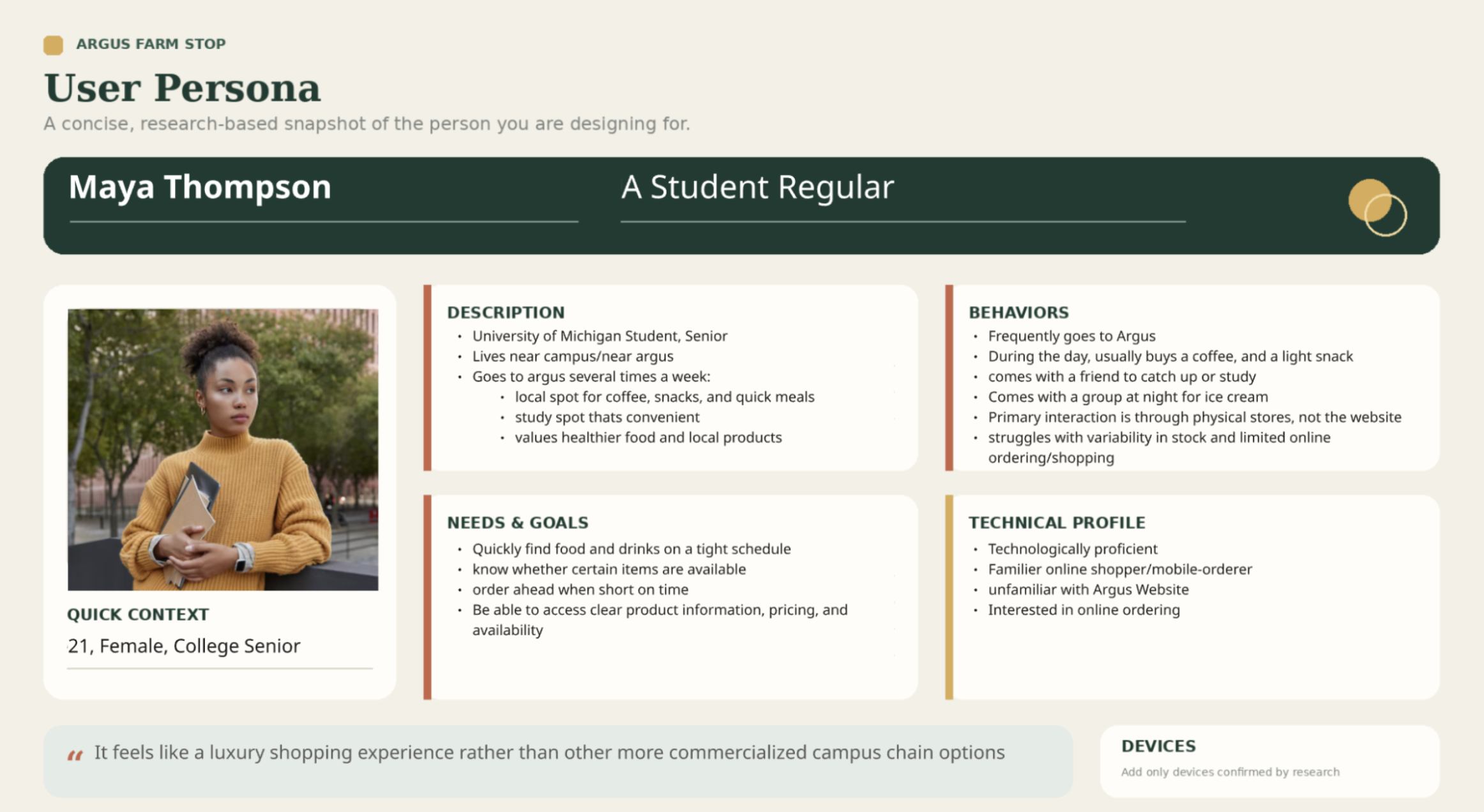
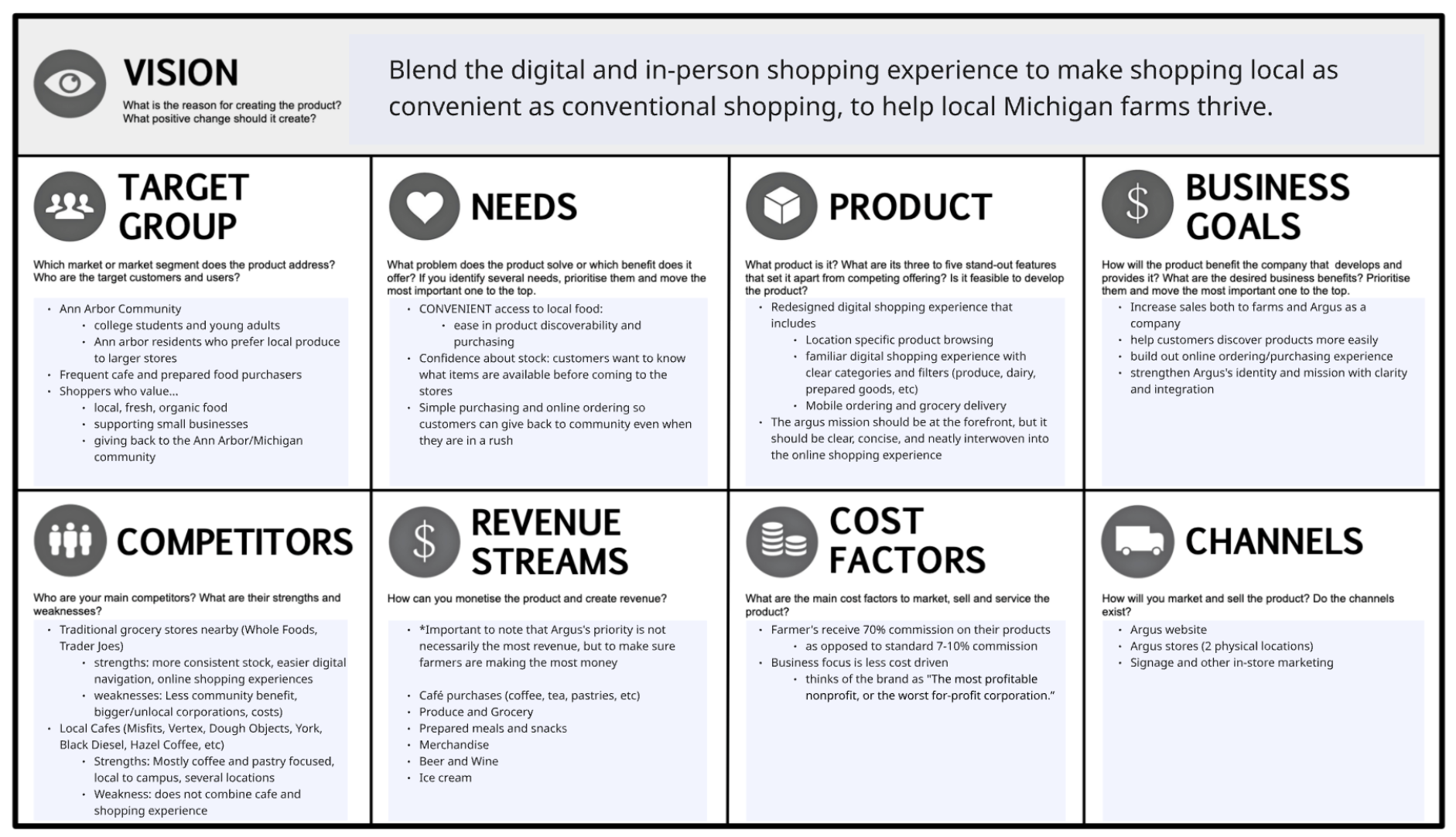
I translated user findings into a stereotypical persona and vision board to clarify the standard user and business needs and goals. This helped me prioritize ordering convenience and clear product information, while maintaining visibility for farmers as the central goal of my redesign.
User persona
Vision Board
Step 2: THE DESIGN PROCESS
Sketches:
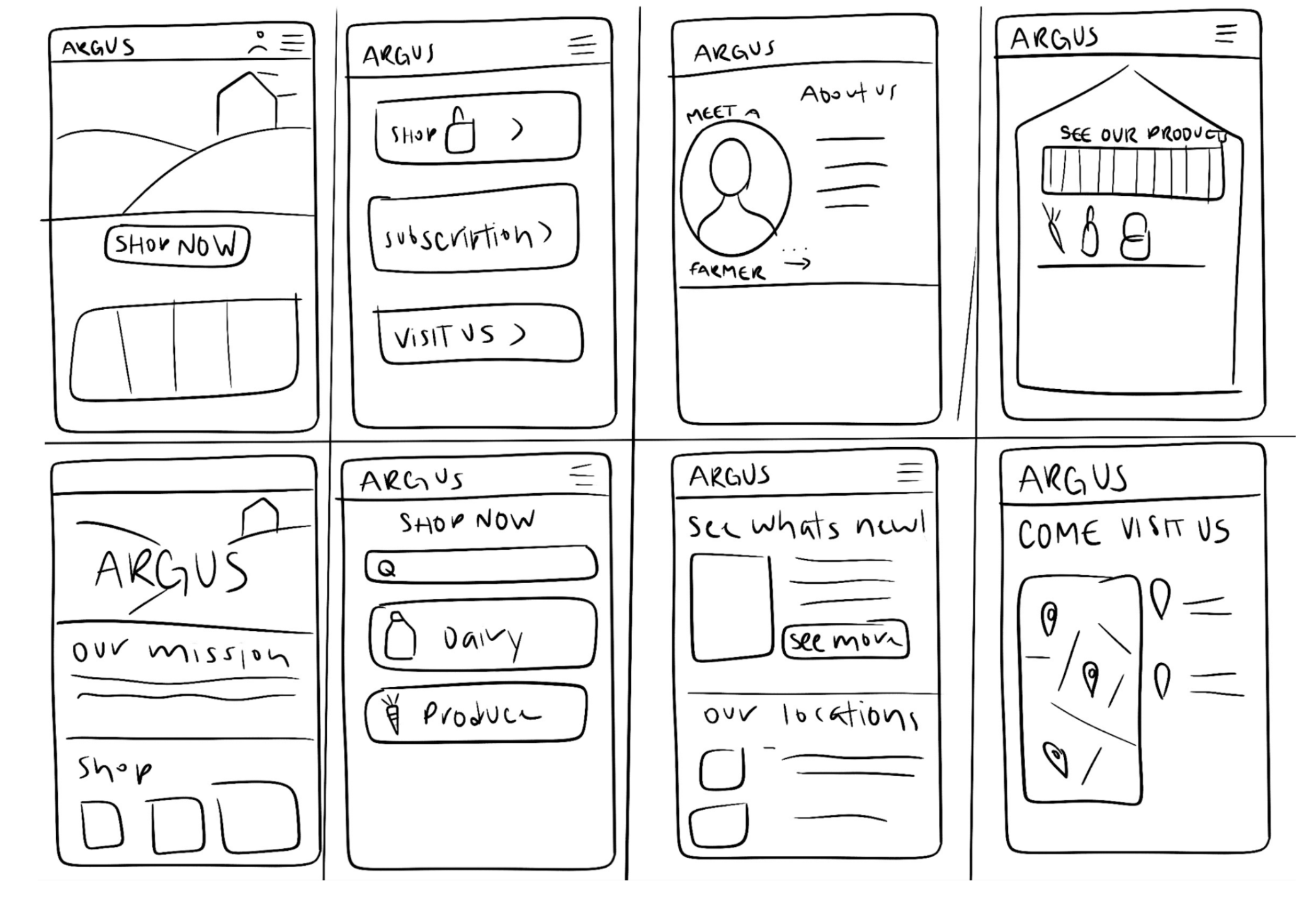
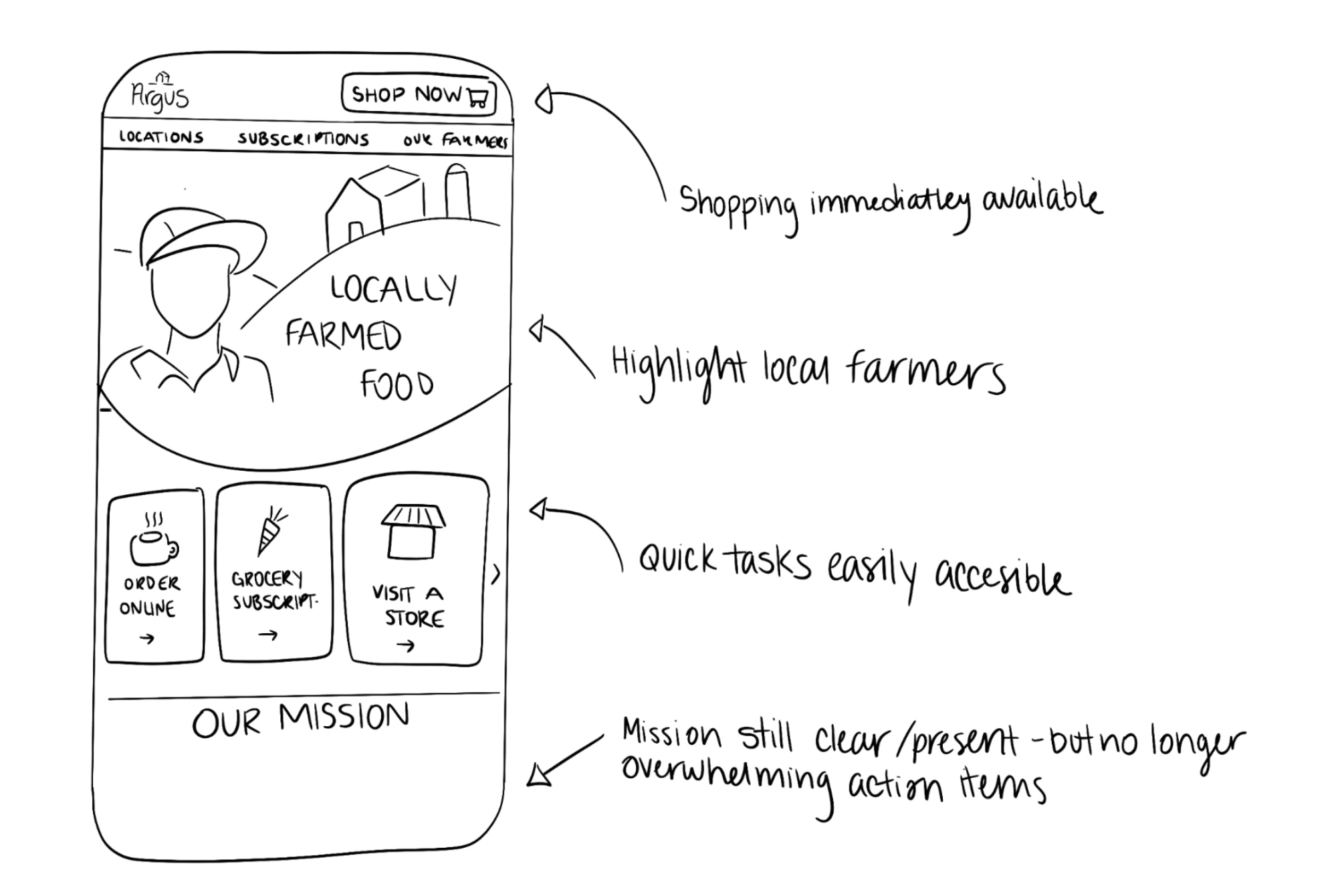
By using the “Crazy 8s” sketching method, I explored different ways to organize the homepage, making sure to include various shopping options, introduce Argus’s mission, and keep the farmers at the forefront. I combined these ideas into a final sketch for the site’s homepage.
Building a design system:
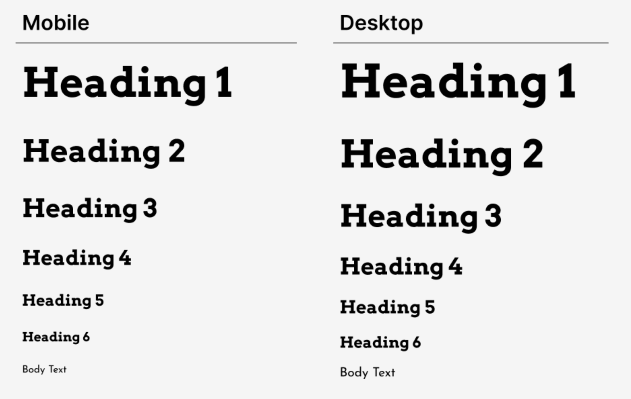
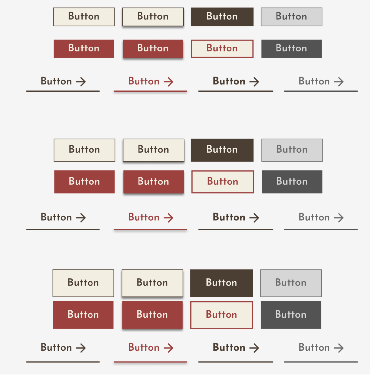
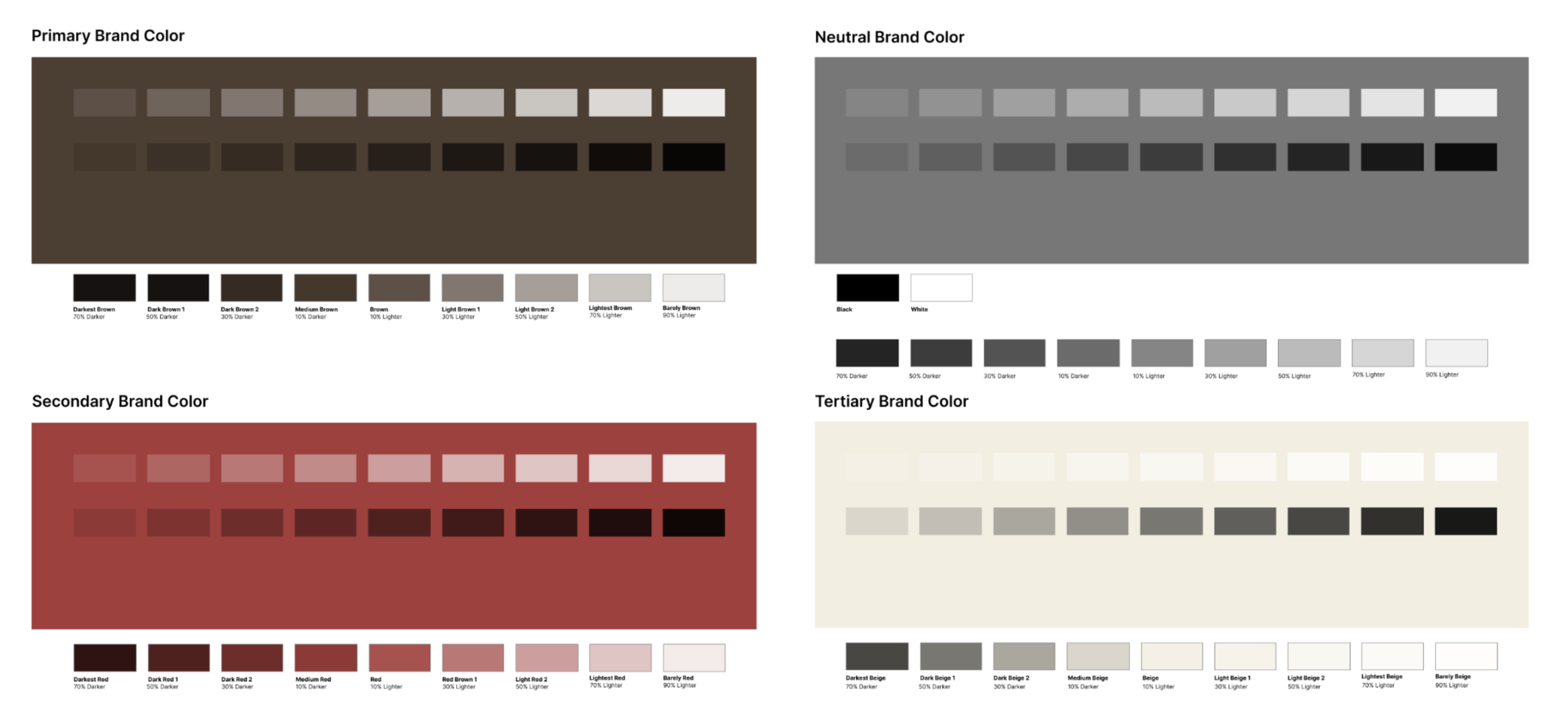
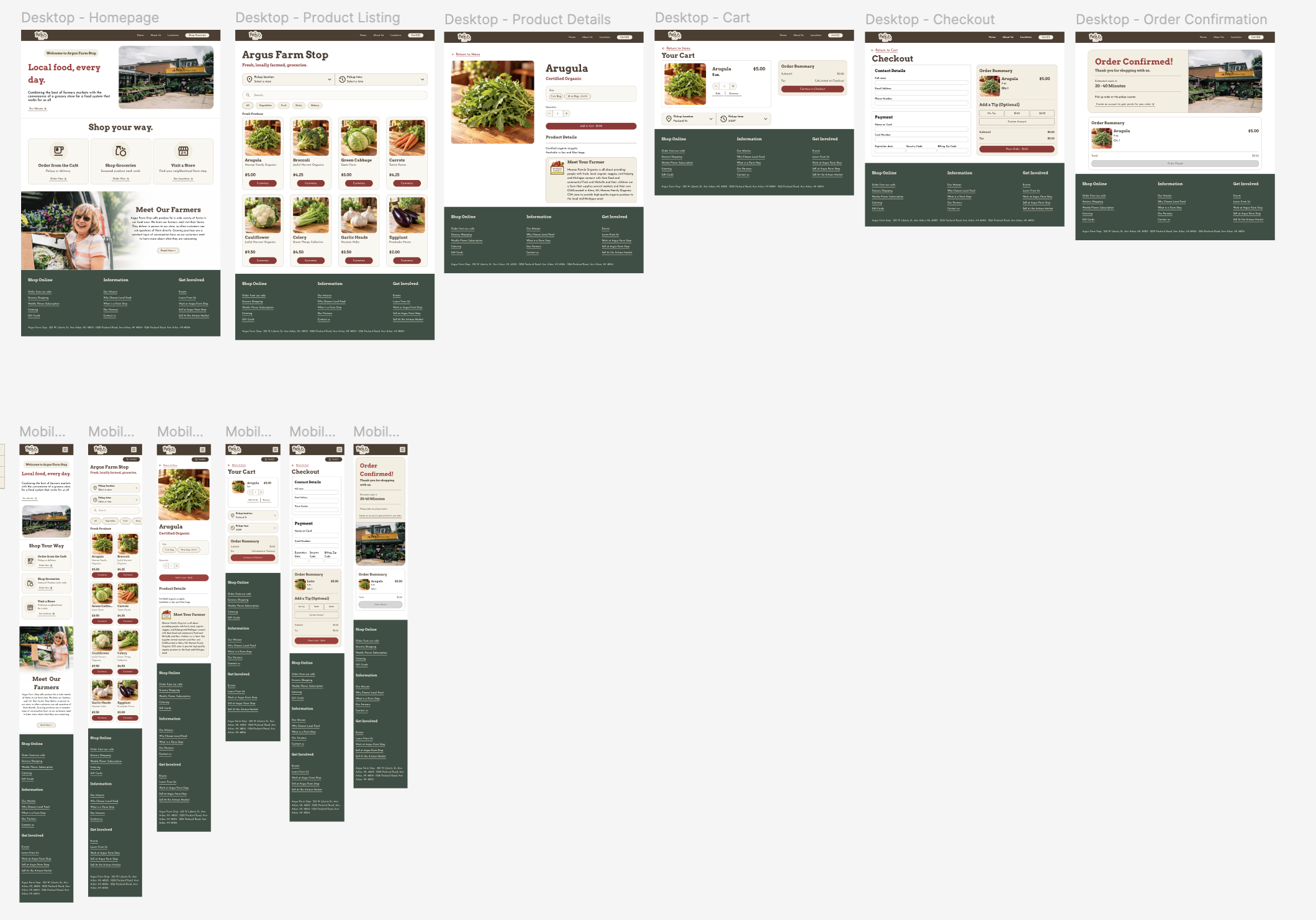
I selected Argus’s trademark warm brown, red, and beige as brand colors to reflect the in-store atmosphere. I used Arvo as the header font to establish hierarchy, while keeping Josefin Sans as the body text in order to keep a connection to the existing brand. Creating reusable buttons, product cards, and form components helped keep my desktop and mobile layouts consistent.
First iteration:
I built desktop and mobile layouts for the purchase journey, from the homepage through order confirmation.
Step 3: Testing the design
User Testing:
In order to test my new website design, I conducted 3 unmoderated usability tests asking them to complete one task on both the prototype and existing website:
“Starting on the homepage, find a 5oz bag of Arugula you can order for pickup. Order one 5oz bag for pickup”
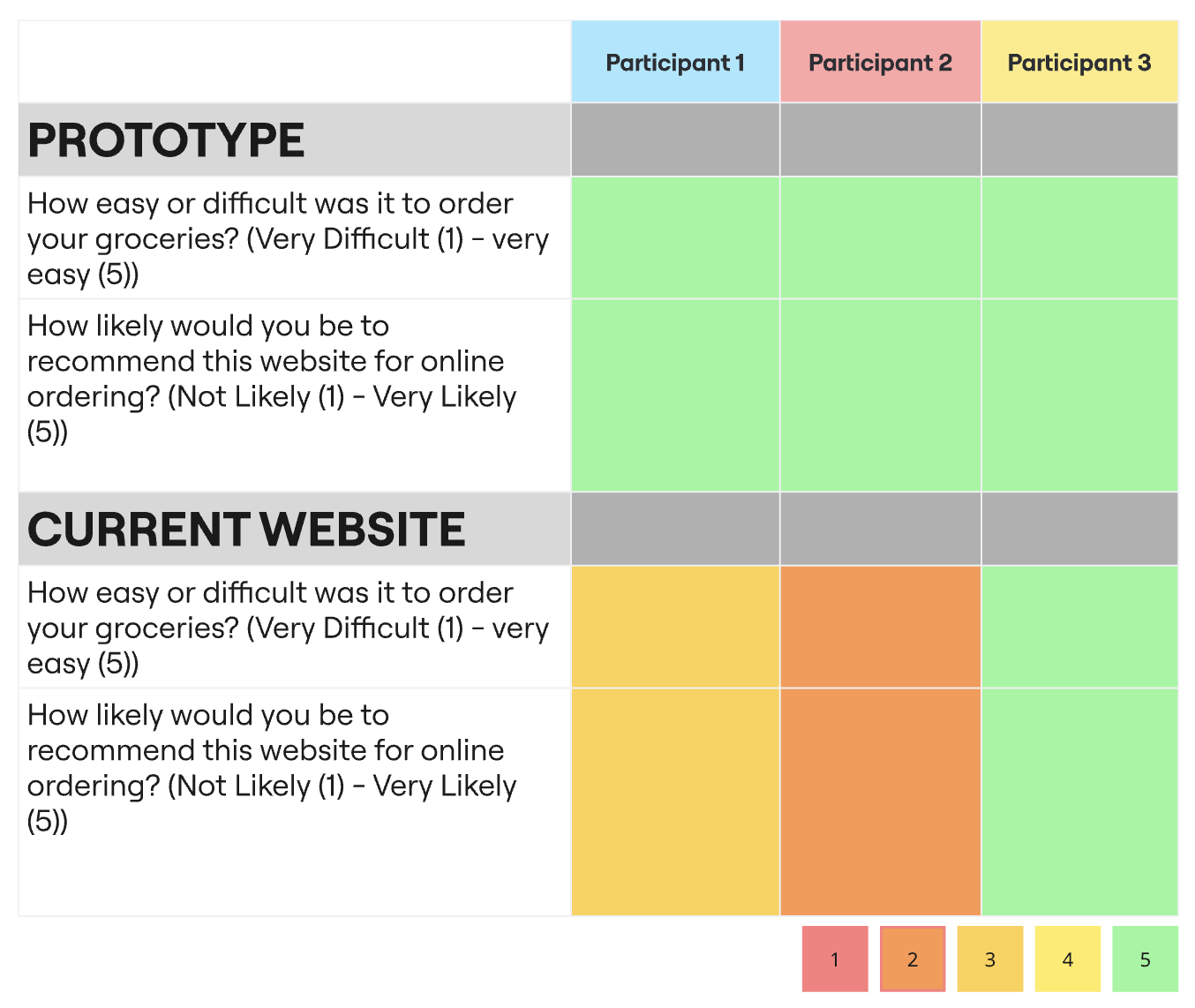
All three participants expressed a preference for my prototype experience as opposed to the current website.
Current website:
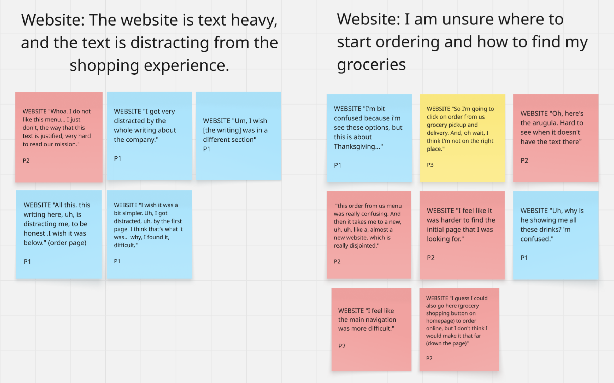
Participants 1 and 2 found navigation particularly confusing and text-heavy pages highly distracting
“This ‘order from us’ menu was really confusing. And then it takes me to… almost a new website, which is really disjointed.” — P2
“I got very distracted by the whole writing about the company.” — P1
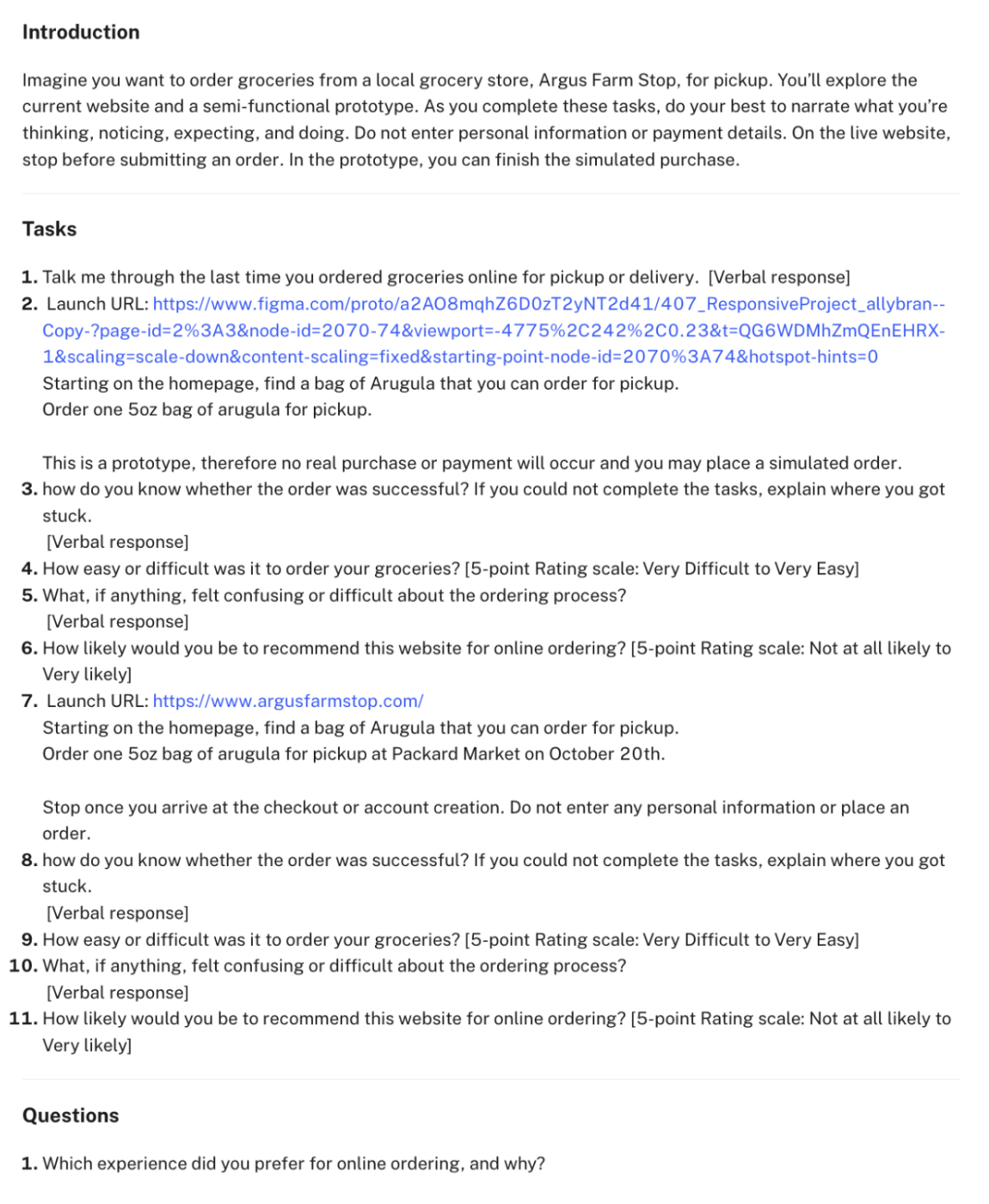
User Testing Outline
Affinity Mapping:
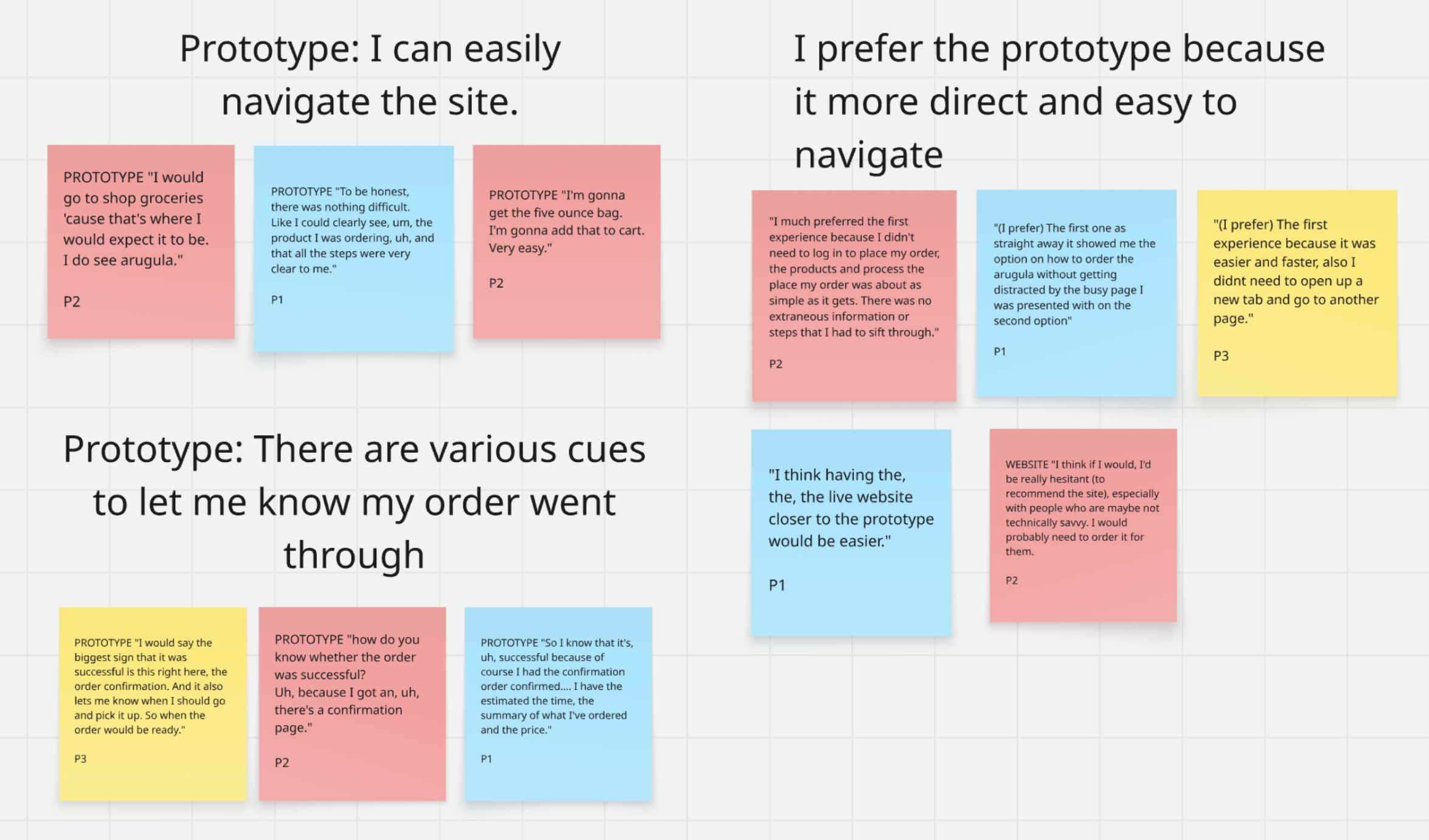
To analyze the unmoderated interviews, I organized selected user quotes into themes around navigation, product visibility, distracting text, and order confirmation.
Current Prototype:
All three described ordering as easy and recognized the confirmation pages as signs of success.
“I would go to “shop for groceries” ’cause that’s where I would expect it to be.” — P2
“The first experience…was easier and faster; also I didn’t need to open up a new tab and go to another page.” — P3
Survey Question Results
Step 4: Revise & Finalize
Revisions:
Testing was highly supportive of my initial designs with some refinement on interaction details. Participants expected certain features, like price updating when tip was added, that were not included. Therefore, I added several behaviors for developers explaining to code for these interactions.
I also improved button color contrast to make sure my design passed all accessibility requirements.
Before and afters
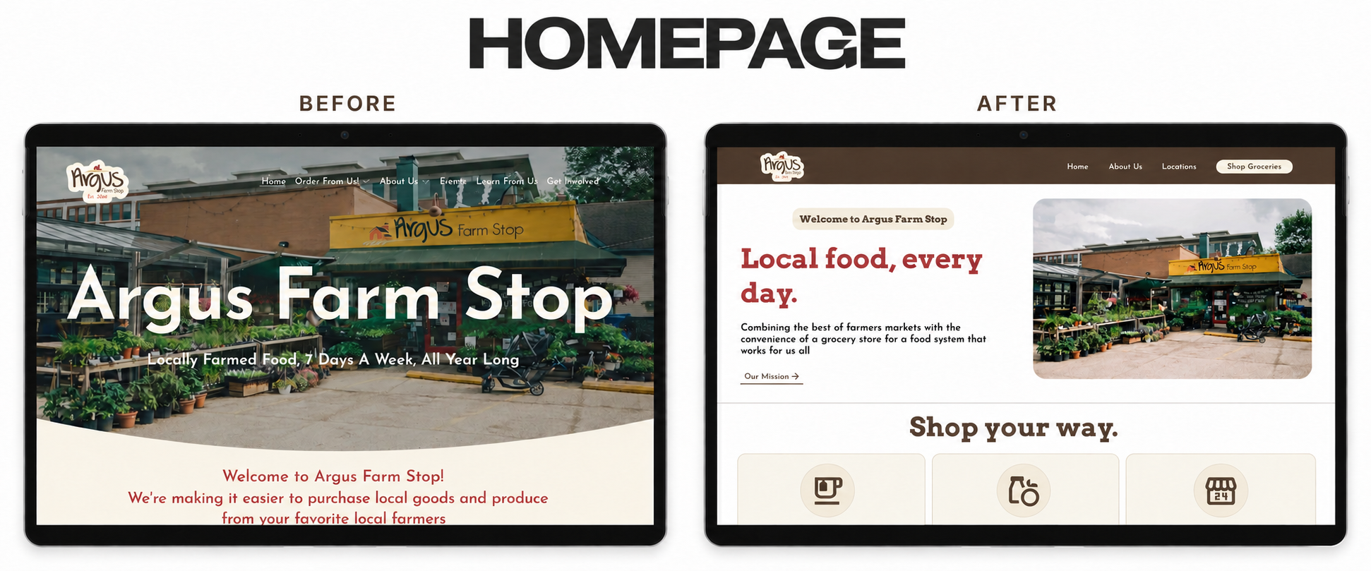
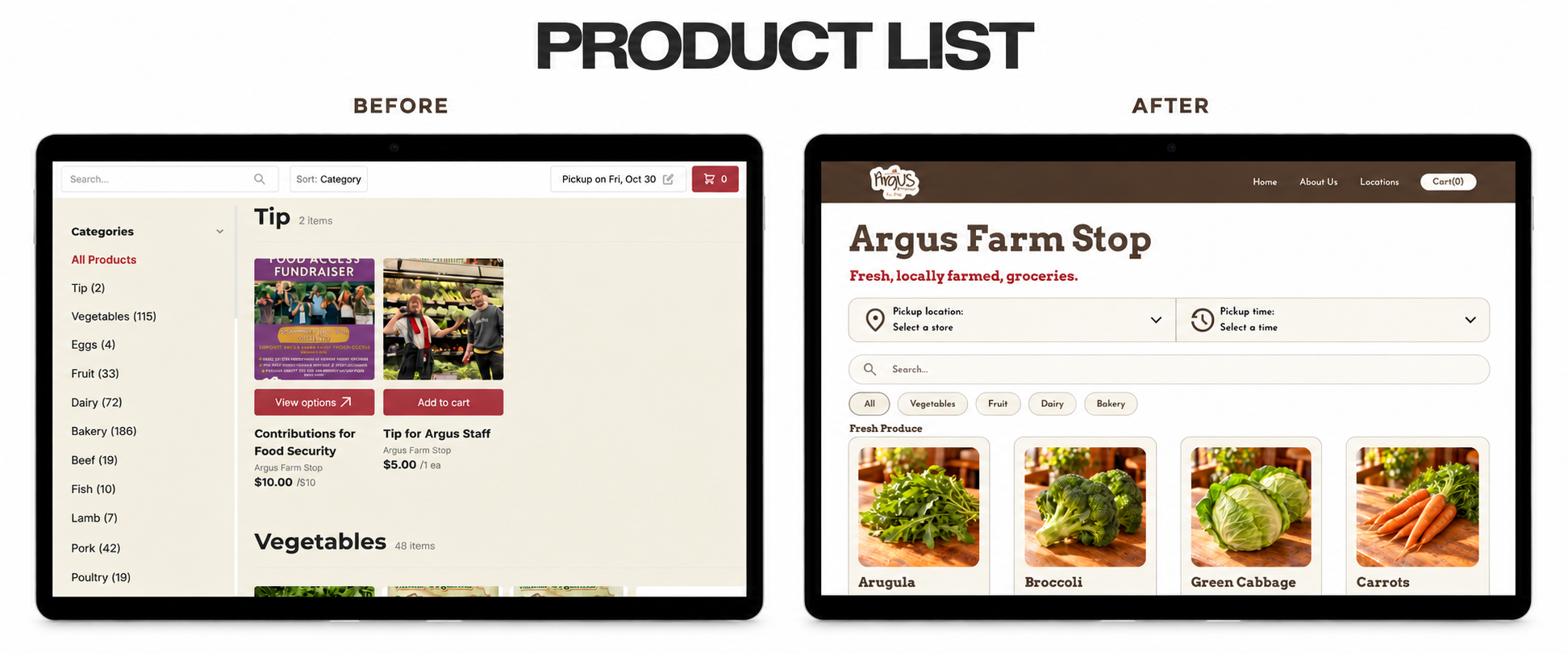
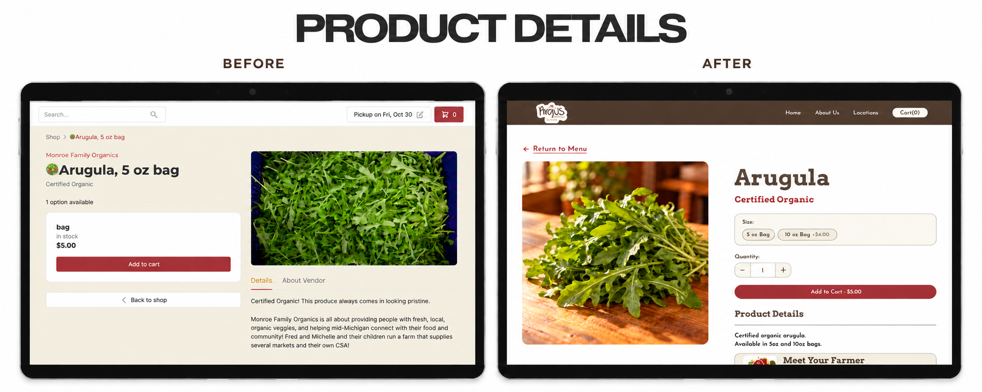
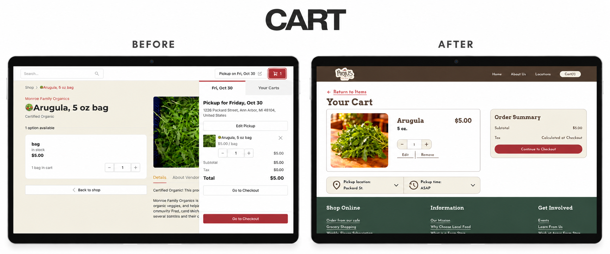
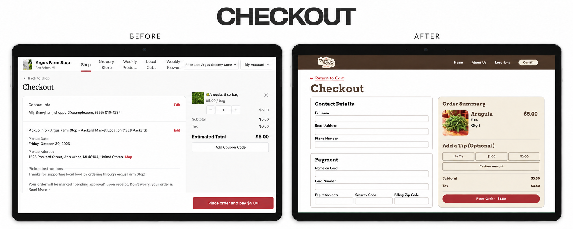
In Conclusion…
What the research revealed
Customers value Argus’s mission, but its website can make ordering feel disconnected from that experience. User testing participants struggled with navigation and distracting text on the existing site, highlighting the need for a clearer path to products.
What the redesign achieved
All three participants completed the simulated purchase and described the prototype as easy to use. Clearly labeled shopping options, minimal text, and recognizable checkout flows supported confident ordering while keeping Argus’s farmers and identity visible.
What I learned
This project showed me that a meaningful brand experience depends on both storytelling and usability. Making local food easier to find and purchase can support the same mission that makes Argus special in person.